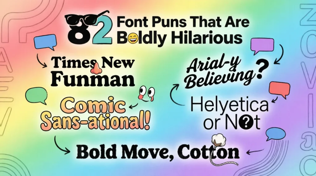
Need some typography humor that really makes a statement? These 82 font puns and jokes are perfect for Instagram captions, graphic designer chats, classroom laughs, birthday cards, and creative office banter. Scroll through and start copying your favorite witty typeface lines.
The Best Font Puns (Start Here)
I told my font joke in Comic Sans, so nobody took it seriously.
That typeface has a bold personality.
I’m trying to stay positive, but my mood keeps going italic.
Fonts always know how to make an impression.
You’re just my type.
Kerning this much confidence should be illegal.
Helvetica and I have a very clean relationship.
That designer really raised the bar with uppercase energy.
Short Font One-Liners
These quick typography jokes are great for everyday laughs, designer bios, and snappy conversations. They’re short, punchy, and easy to drop into any creative setting.
I’m feeling extra bold today.
That joke was poorly aligned.
Fonts always speak volumes.
I like my humor sans drama.
My attitude is set to all caps.
This friendship has great character spacing.
I’m just here for the type hype.
Stop serif-ing around and focus.
That font has serious main character energy.
I tried to relax, but my thoughts kept underlining everything.
This meeting could’ve been an email in 12-point Times New Roman.
I’m naturally well-fonted.
Funny Font Jokes
These Q&A-style font jokes are ideal for classrooms, designer group chats, and anyone who enjoys clever nerd humor with a typographic twist.
Q: Why did the font break up with the paragraph? A: It needed more space.
Q: Why was the typeface so calm? A: It had great alignment.
Q: Why did Comic Sans get kicked out of the design studio? A: It couldn’t read the room.
Q: Why did the font go to therapy? A: It had too many unresolved characters.
Q: Why was the bold font always invited to parties? A: It really stood out.
Q: Why did the designer cry over kerning? A: The spacing felt distant.
Q: Why did the typewriter start gossiping? A: It heard everything in black and white.
Q: Why did the font fail the driving test? A: It couldn’t stay between the lines.
Q: Why are serif fonts so classy? A: They always add a little extra detail.
Q: Why did Arial feel insecure? A: Everyone kept calling it basic.
Q: Why did the typography teacher quit? A: Too many mixed signals.
Q: Why was the font always tired? A: It worked overtime in every document.
Font Puns for Social Media Captions
These witty font captions are made for graphic design posts, creative selfies, workspace photos, and artsy Instagram uploads.
Serving bold looks and clean lines.
Current mood: italic and slightly dramatic.
Just my type of day.
Too glam to use default fonts.
Making life look well-formatted.
Small caps, big energy.
This outfit deserves premium typography.
Proof that good spacing changes everything.
Caught between minimalist and extra bold.
Fonts before flaws.
Keeping it clean like Helvetica on a white background.
Today’s aesthetic is professionally kerned.
Workplace & Designer Humor
Graphic designers, editors, and typography nerds will appreciate these inside jokes about deadlines, layouts, and creative chaos.
My font choices are stronger than my coffee.
Designers don’t argue — they just change the font until they win.
I survived another client asking for “something fun but professional.”
That project went from rough draft to fine print.
Good typography is like good Wi-Fi — invisible when it works.
My toxic trait is defending kerning at dinner parties.
Creative burnout hits different in all lowercase.
Every designer has trust issues with free fonts.
I measure success in perfectly aligned text boxes.
Nothing ruins a Monday like stretched fonts.
I’d explain typography, but it’s a character issue.
Deadlines hit harder when the client wants “just one tiny edit.”
Flirty Font Puns
These playful typography puns are perfect for crush texts, dating app bios, Valentine’s cards, or clever compliments with creative flair.
You’re exactly my type.
You make my heart go bold.
We’ve got great chemistry and even better spacing.
You had me at Helvetica.
I think we’re perfectly aligned.
You bring color to my grayscale world.
I’d never ghost someone with your character.
Our connection is beautifully kerned.
You make my standards go uppercase.
You’re the highlight of my text.
You must be a premium font, because you look expensive.
I’m drawn to you like designers to clean typography.
Nerdy Typography Humor
These clever font jokes lean into design theory, print culture, and typography terminology for readers who truly appreciate the art of type.
Kerning is just couples therapy for letters.
A badly chosen font can really alter the tone.
Typography is proof that spacing matters in relationships.
Some people peak in high school — designers peak in font menus.
The serif font walked in with old-money energy.
Sans serif fonts are basically the minimalist influencers of typography.
Comic Sans is the pineapple pizza of graphic design.
Nothing tests patience like searching for the “perfect” font at 2 a.m.
Typography nerds notice bad kerning from three rooms away.
A strong font pairing is basically a power couple.
Designers don’t see letters — they see personality traits.
Every font carries emotional baggage from past presentations.
How to Use These Font Puns
Font puns work surprisingly well in everyday creative life. If you’re posting a new logo design, sharing your latest art project, or showing off a clean workspace setup, witty typography captions can make your content feel more memorable and engaging. Many designers also use funny font sayings in portfolios, presentation slides, and creative newsletters to add personality without sounding overly formal.
These font jokes are also great for lightening up conversations in design classes, office chats, or freelance group messages. A clever typeface pun can instantly make creative discussions feel more fun and relatable. If you make greeting cards, stickers, T-shirts, or digital prints, these witty font lines can easily become catchy product text or social captions.
You can even use typography humor in dating profiles, birthday cards, or casual texts with artsy friends. The best font humor works because it blends creativity, personality, and a little bit of design-world chaos into one perfectly aligned joke.
Frequently Asked Questions
Q: What is a good pun about fonts? A: One of the most popular font puns is “You’re just my type.” It works because it blends typography terminology with relationship humor in a simple, clever way. Short typeface jokes like this are easy to use in captions, cards, and conversations.
Q: What are funny font one-liners? A: Funny font one-liners include jokes like “I’m feeling extra bold today” or “Comic Sans ruined the vibe again.” The best ones play with typography terms like serif, kerning, alignment, and italics in relatable situations.
Q: Are font puns good for Instagram captions? A: Yes, font puns are perfect for Instagram captions, especially for designers, artists, students, and creative brands. They add personality to posts without sounding forced, and they work well with workspace photos, graphic designs, or aesthetic content.
Q: What makes a font pun funny? A: A strong font pun mixes typography vocabulary with everyday emotions or situations. Humor lands best when the joke feels natural, clever, and connected to real design experiences people recognize.
Q: What do you call a typography joke? A: Most people simply call them font puns or typography jokes. Designers sometimes refer to them as “type humor” because they revolve around fonts, layouts, spacing, and creative industry culture.
Raj Patel joined FurryPuns with a vision to combine his comedic talent with his love for exotic animals. Holding a degree in Media Studies and a background in stand-up comedy, Raj brings a vibrant energy to his writing. He enjoys exploring the quirky behaviors of axolotls, badgers, and alligators, weaving them into food and lifestyle narratives that capture the imaginations of readers. His content is designed to be both entertaining and heartwarming, perfect for those seeking cute, shareable humor. Raj specializes in creating pun-filled content that doubles as endearing captions and delightful Valentine’s messages, cementing his place as a favorite among FurryPuns’ audience.